
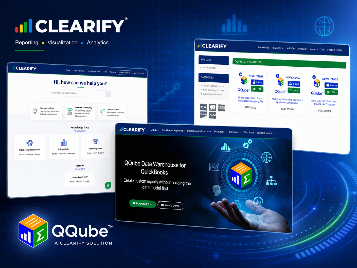
Over the past several months, we have been working through a broad refresh of CLEARIFY and QQube.
Some of the changes are immediately visible: updated branding, cleaner page layouts, new graphics, current product screenshots, and a more consistent visual identity.
Others are less obvious but just as important. We have clarified how we explain QQube, reorganized the website around the questions customers are actually trying to answer, and substantially rebuilt the way information is presented in the QQube Support Center.
The goal was not simply to make the websites look newer. We wanted the entire CLEARIFY web experience to be clearer, more useful, and more consistent from the first visit through purchasing, implementation, reporting, and support.
A Fresh CLEARIFY and QQube Identity
One of the most visible changes is the refreshed presentation of CLEARIFY and QQube.
We standardized our branding assets and how they are used across the main website, online store, Support Center, product graphics, reporting examples, and other customer-facing materials.
QQube also received an updated presentation that better reflects the product today while preserving the familiar QQube identity.
The result is a cleaner and more contemporary visual system that carries naturally from one CLEARIFY property to another.
But branding was only one part of the project.
A Clearer Explanation of What QQube Does
An equally important goal was improving how we explain QQube.
QQube is much more than a connection to QuickBooks. A basic connector can extract data. QQube goes considerably further by organizing and preparing that information for reporting.
It provides the relationships, accounting logic, calculations, company identification, and reporting structure needed for the reporting subject being used.
That led us to a much clearer way of describing the product:
QQube organizes and prepares your QuickBooks data into comprehensive reporting models. You just build the report in the application that best fits your needs.
That message now carries throughout our websites and supporting materials.
It also reflects the experience QQube was designed to provide. Customers should not have to become experts in the QuickBooks database, SDK, table relationships, or accounting data structures just to build the report they need.
QQube prepares the reporting foundation so the customer can concentrate on the report itself.
Reporting Comes First
We also reorganized the main website around the questions customers are actually trying to answer.
The first question usually is not, “What database structure do I need?”
It is something more practical:
What can I report?
That may mean financial statements, customers and receivables, vendors and payables, job costing, inventory, payroll, audit history, general ledger activity, or another QuickBooks reporting subject.
The next question is where the customer wants to build and present that report.
QQube supports familiar reporting applications including Excel, Power BI, Power Pivot, Microsoft Access, Crystal Reports, and Tableau.
Those are two separate decisions: what business information do I need, and which application is best for presenting it?
The revised website makes that distinction much clearer.
Updated Reporting Examples
We have also spent considerable time improving the reporting examples throughout the site.
Rather than relying primarily on descriptions of what QQube can do, we wanted visitors to see actual reporting output.
The updated site uses real Excel reports, Power BI dashboards, financial statements, audit reports, job-cost reports, inventory analysis, and other QQube examples to demonstrate what customers can build.
That visual proof is important.
A screenshot of a finished report can often communicate more than several paragraphs describing the underlying capability.
The words explain what QQube prepares. The examples show what that prepared information can become.
One CLEARIFY Experience Across Three Websites
CLEARIFY operates three websites, and each one has a different job.
clearify.com explains QQube, demonstrates its capabilities, and helps prospective customers determine whether the product fits their reporting needs.
store.clearify.com handles product configuration, licensing choices, company-file options, subscription renewals, and purchasing.
support.clearify.com provides the technical information customers need to install, configure, synchronize, use, understand, and troubleshoot QQube.
Those sites should not contain the same information, because they serve different purposes.
They should, however, clearly feel like they belong to the same company and describe the same product.
The branding, terminology, product descriptions, and overall presentation are now much more consistent as customers move between them.
A Major Improvement to the QQube Support Center
Some of the most extensive work in this project took place in the QQube Support Center.
QQube has accumulated a substantial body of technical documentation over many years. That depth is important. Customers working with a particular reporting model, synchronization issue, field, installation option, or reporting application often need very specific information.
Technical documentation still needs to be technical.
We did not want to reduce that depth.
Instead, we wanted to make the information easier to read, easier to scan, and easier to follow.
To accomplish that, we established a consistent layout and component system for the Knowledge Base.
Headings now follow a predictable hierarchy. Important notes are presented consistently. Procedures, screenshots, tables, warnings, code, and expected results each have an appropriate visual treatment.
Spacing and page structure are also standardized so articles no longer feel as though each one was formatted independently.
The result is documentation that retains its technical precision while being considerably easier to consume.
Clearer Directions and Better Use of Screenshots
Screenshots received particular attention.
A software screenshot is most useful when the reader immediately understands why it is there and what they are expected to do with it.
Images that instruct a user to click, select, configure, or verify something are now visually associated with those instructions.
Conceptual diagrams and reference images are treated differently because they serve a different purpose.
Procedural steps can also keep their explanation and screenshot together, making it easier to move through an installation or configuration process without losing the connection between the written direction and the interface being shown.
These may sound like small design decisions, but they make a significant difference in a technical article.
Troubleshooting That Is Easier to Navigate
We also improved the organization of issue-resolution articles.
When something goes wrong, customers generally need several answers quickly:
What does this error mean?
What may have caused it?
What should I do?
What should happen when the problem is resolved?
Troubleshooting articles are now organized more consistently around that process.
Where appropriate, they use sections such as Overview, What the Error Means, Possible Causes, Resolution, and Expected Result.
Important instructions are easier to distinguish from ordinary explanation, while potentially destructive actions receive a stronger warning treatment.
The objective is to make the path from problem to resolution easier to see.
Better Technical Reference Pages Without Losing the Detail
The same approach extends to QQube’s deeper technical documentation.
Data-model pages, field references, DAX documentation, implementation instructions, and other advanced material still contain the detailed information experienced users and developers need.
What has changed is how that information is organized and presented.
Tables now follow consistent formats. Technical values are easier to distinguish. Related explanations and screenshots stay together. Heading levels have consistent meaning. Reusable presentation rules replace one-off formatting.
The intent is not to make advanced documentation less technical.
It is to make technical depth easier to navigate.
Release Notes and Product Announcements
QQube release notes and product announcements have also received attention.
These posts serve a different purpose from Knowledge Base articles, so they use a simpler presentation designed for announcements rather than procedural documentation.
Release titles, major sections, feature labels, paragraphs, lists, and links now follow a consistent structure.
Historical release information remains intact, while shared presentation rules make older posts easier to read alongside current announcements.
That gives customers a more useful product history without rewriting the technical record.
The Same QQube, Presented Better
QQube has always been built around a straightforward idea: customers should be able to report on their QuickBooks information without first having to reconstruct the underlying reporting foundation.
That has not changed.
What has changed is how clearly we communicate it and how consistently customers experience around it.
The refreshed branding, clearer product messaging, improved reporting examples, coordinated three-site experience, and extensively updated Support Center now provide a better reflection of CLEARIFY and QQube today.
